Ancorius
Branding & Web Design
Founded in 1995 by Jean-Marc Faber, Fiduciaire Jean Marc Faber (FJMF) became one of Luxembourg’s leading independent providers of trust, fund, and corporate services. Serving over 1,800 clients with a team of 70 professionals, the company built a strong reputation through corporate administration, accountancy, trust, fund, and payroll services.
Under the leadership of Jean-Marc Faber and partners Christophe Mouton and Daniel Galhano, FJMF achieved sustained growth through organic expansion and strategic acquisitions. In 2023, the company was acquired by AnaCap, creating opportunities to accelerate growth and pursue a broader acquisition strategy.
With strong operational expertise, FJMF was well positioned to evolve into a platform business capable of integrating complementary companies, expanding services, and increasing market presence. A key strategic objective was obtaining a PSF licence to broaden its corporate and fund service offering.
To support these ambitions, the company required a new identity that reflected its international aspirations and future scalability.
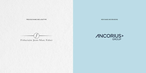
Although highly respected, the FJMF brand remained closely associated with its founder and local Luxembourg roots. As the business expanded internationally and prepared for future acquisitions, the existing identity no longer reflected its corporate ambitions.
The challenge was to create a modern brand that could attract international clients and talent while serving as a unifying platform for future acquisitions.
The rebranding process led to the creation of the name Ancorius name, inspired by the concepts of anchor and core. The name conveys stability, trust, strength, and long-term partnership—qualities central to the company’s role in supporting clients through complex financial and corporate environments.
The new name provides a distinctive and scalable foundation for future growth.
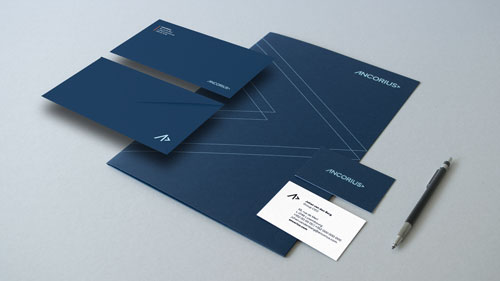
The visual identity was designed to express professionalism, confidence, and stability while presenting a contemporary international image.
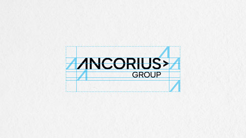
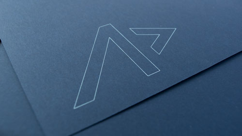
The logo combines the Mundial typeface with a custom stylized “A” and an abstract anchor symbol. The bespoke “A” conveys momentum and progress, while the anchor reinforces reliability, trust, and support.
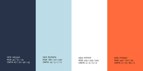
A palette of deep and light blues communicates sophistication and professionalism, helping position Ancorius as a modern international corporate services group. The monogram integrates the “A” and anchor into a flexible symbol used across digital and physical applications.
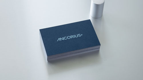
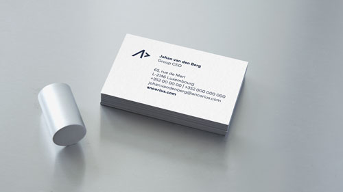
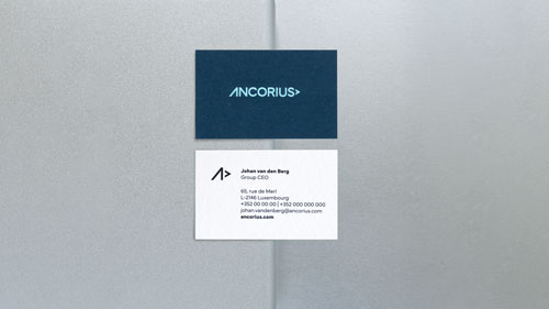
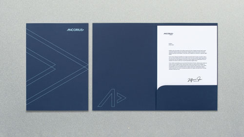
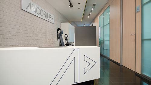
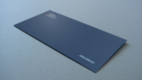
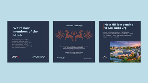
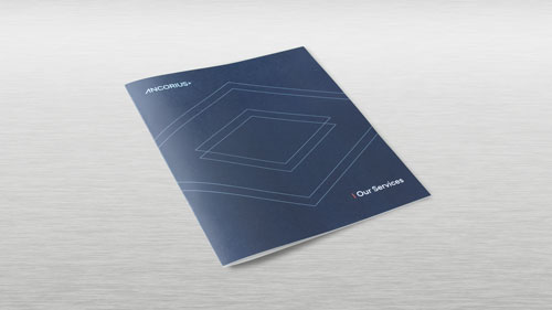
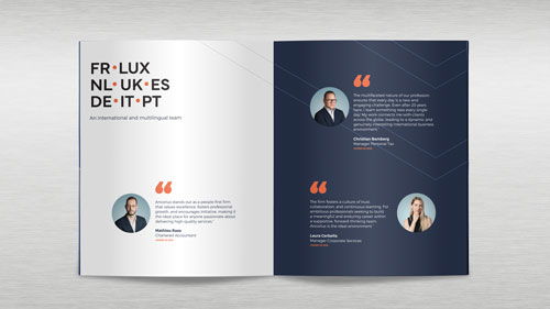
The identity was extended across stationery, business communications, a corporate brochure, and a minimalist website featuring refined interactions and subtle animations. Together, these elements create a consistent brand experience that balances functionality with a premium feel.